
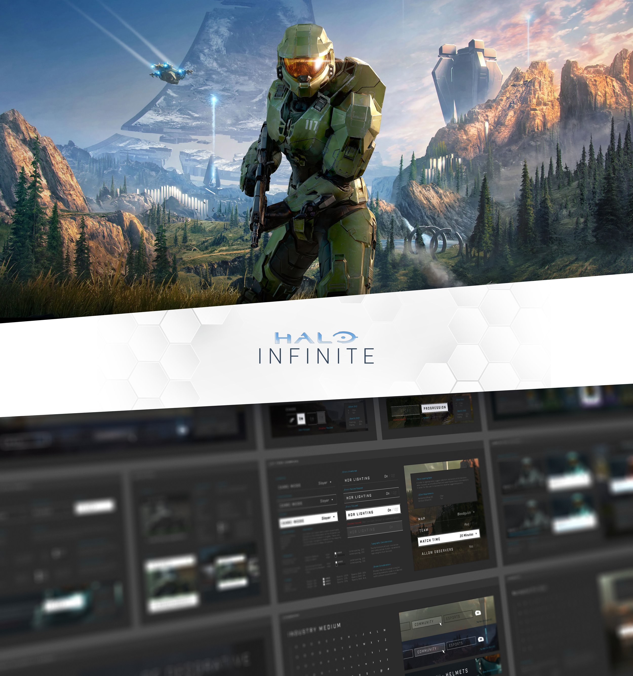
A partial view of the beginnings of Halo Infinite’s design system.
BUILDING Design & Grid Systems
When first joining the project, creating a design system (shown above) was my top priority in gaining forward momentum. With strict deadlines in place, this effort not only wrangled the design language of our interface but also provided the design team with clear guidance and components to use at their disposal. Enabling the team in this way resulted in a reliable toolset they could leverage towards designing the product’s interface while also focusing on the consistency and cohesion of our collective visual language.

The use of Figma was pivotal in standing up our design system, and it was especially helpful as we transitioned to an almost entirely digital studio format in the face of COVID. It became the primary method of cataloguing our visual philosophies as well as a virtual office space for our UX & UI designers / artists to ideate and collaborate.
APPLYING & EXTENDING DESIGN SYSTEMS
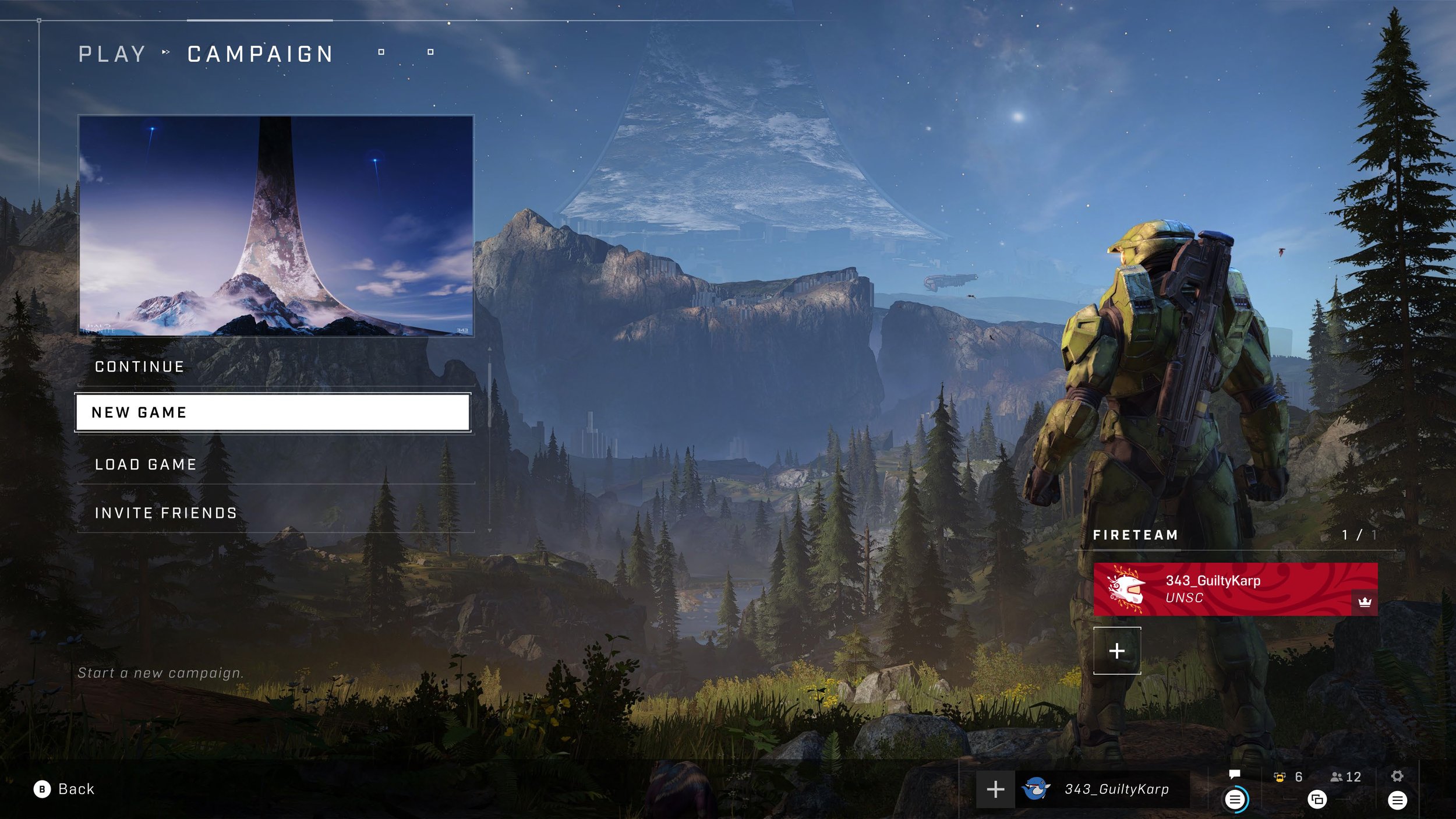
We continued to build upon the various elements and ideologies as the product expanded. These early aspects were important to help focus the team as they went about designing the many UI screens. As a quick example, the creation of our grid system served to frame the foundation for many of our screen templates. This allowed for consistent placement of elements and appropriate considerations of margins for persistent and semi-persistent elements across the product.
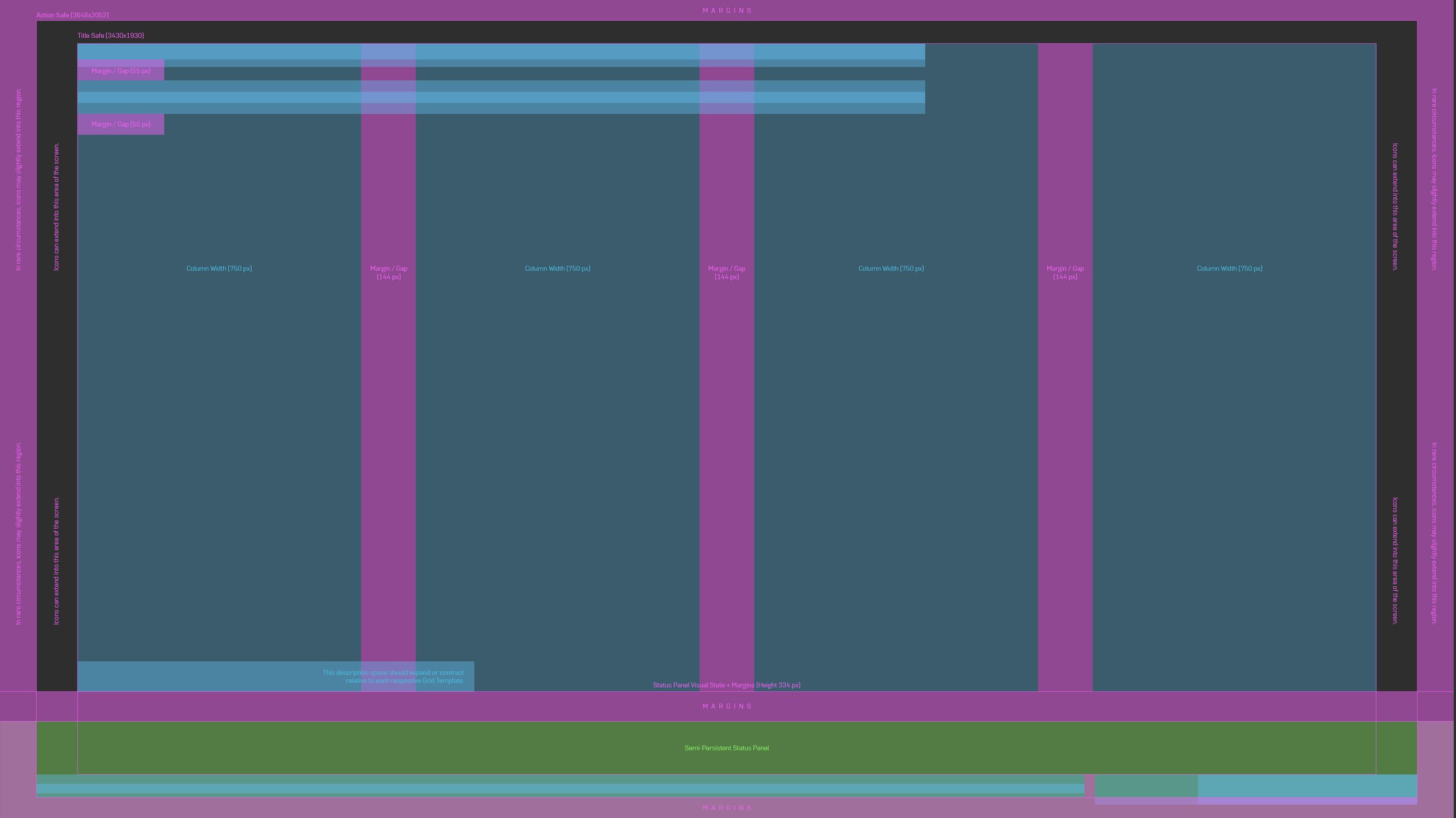
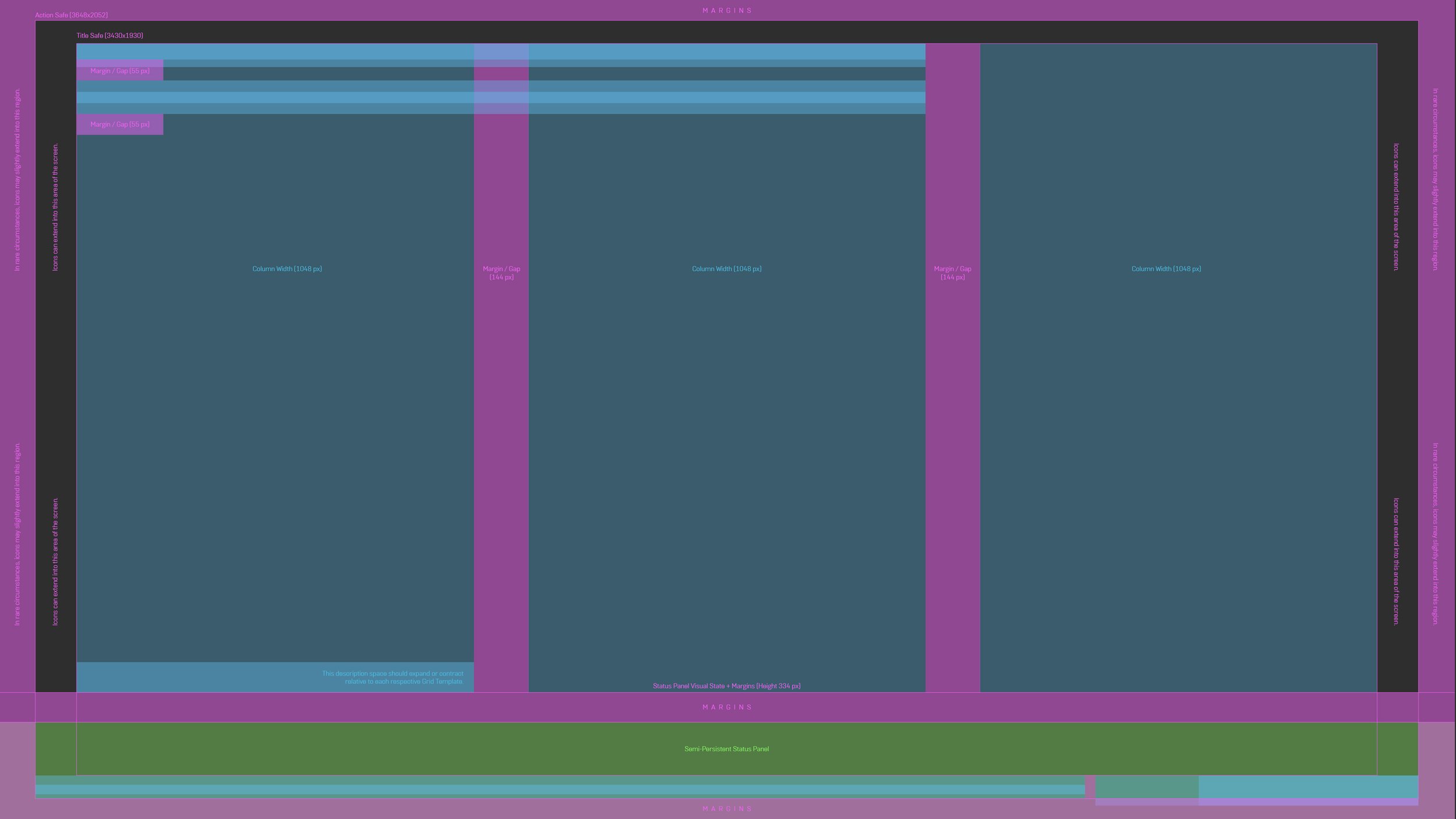
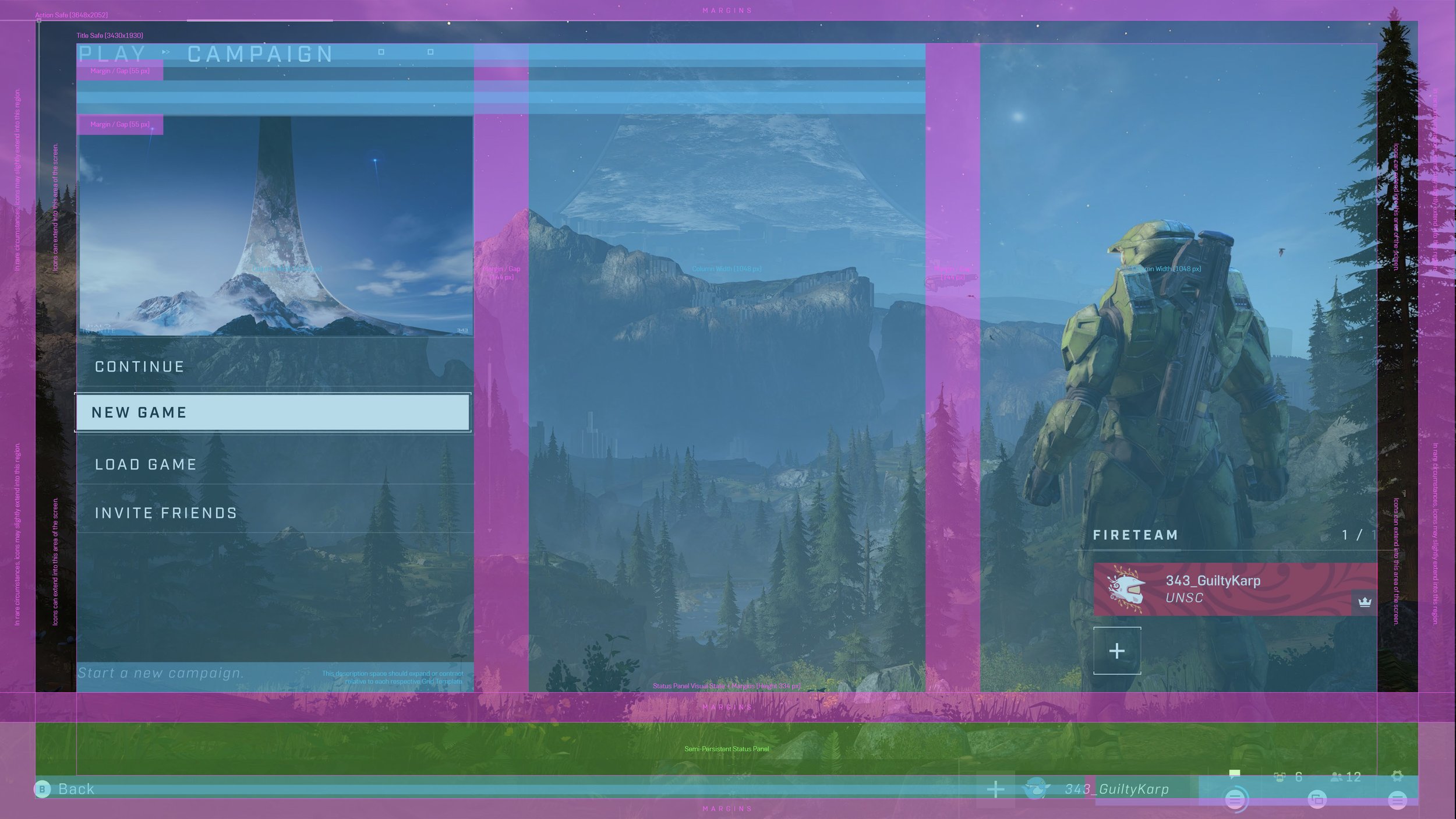
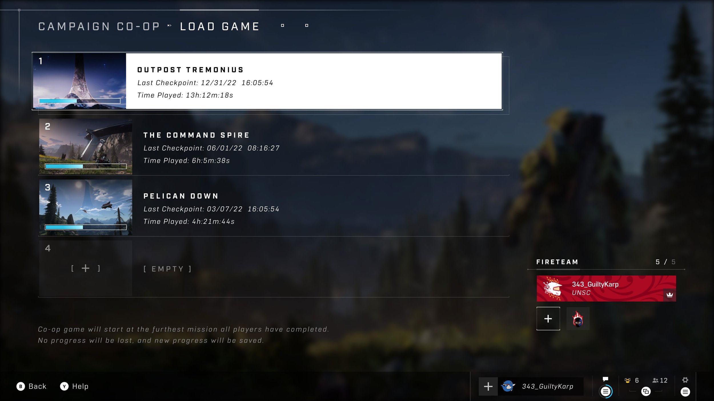
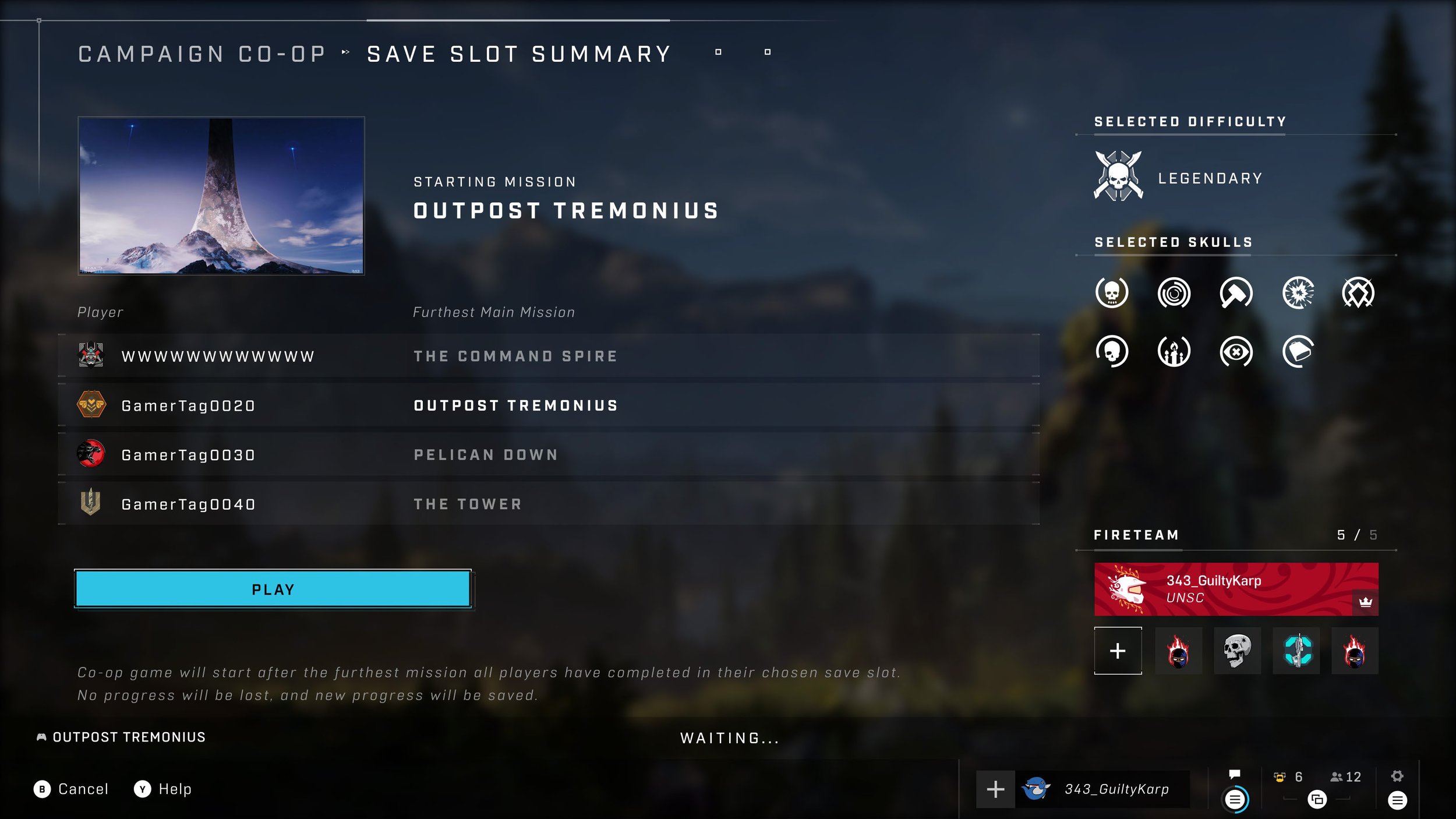
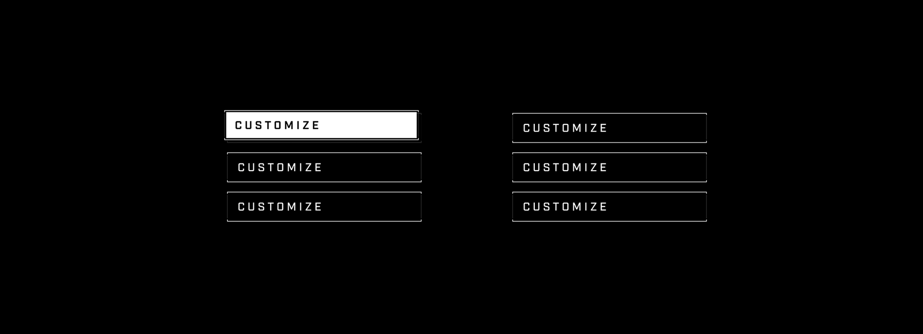
With clear guard rails in place, the team continued to apply and expand upon the abundance of components. We defined color values, dimensions, typefaces, their corresponding values, and more. Below you’ll find a few examples of the design system at work within our campaign coop flow.
With our accelerated timelines, the animation of the UI was an area I wished we had more time to invest in leading up to launch. That said, whenever it was possible I would either animate or work with another designer to create motion targets that provided clear direction on the overall motion philosophy of the product. Throughout this page you’ll find various samples of Infinite’s motion work, but below is a very basic (and early) example of those explorations.
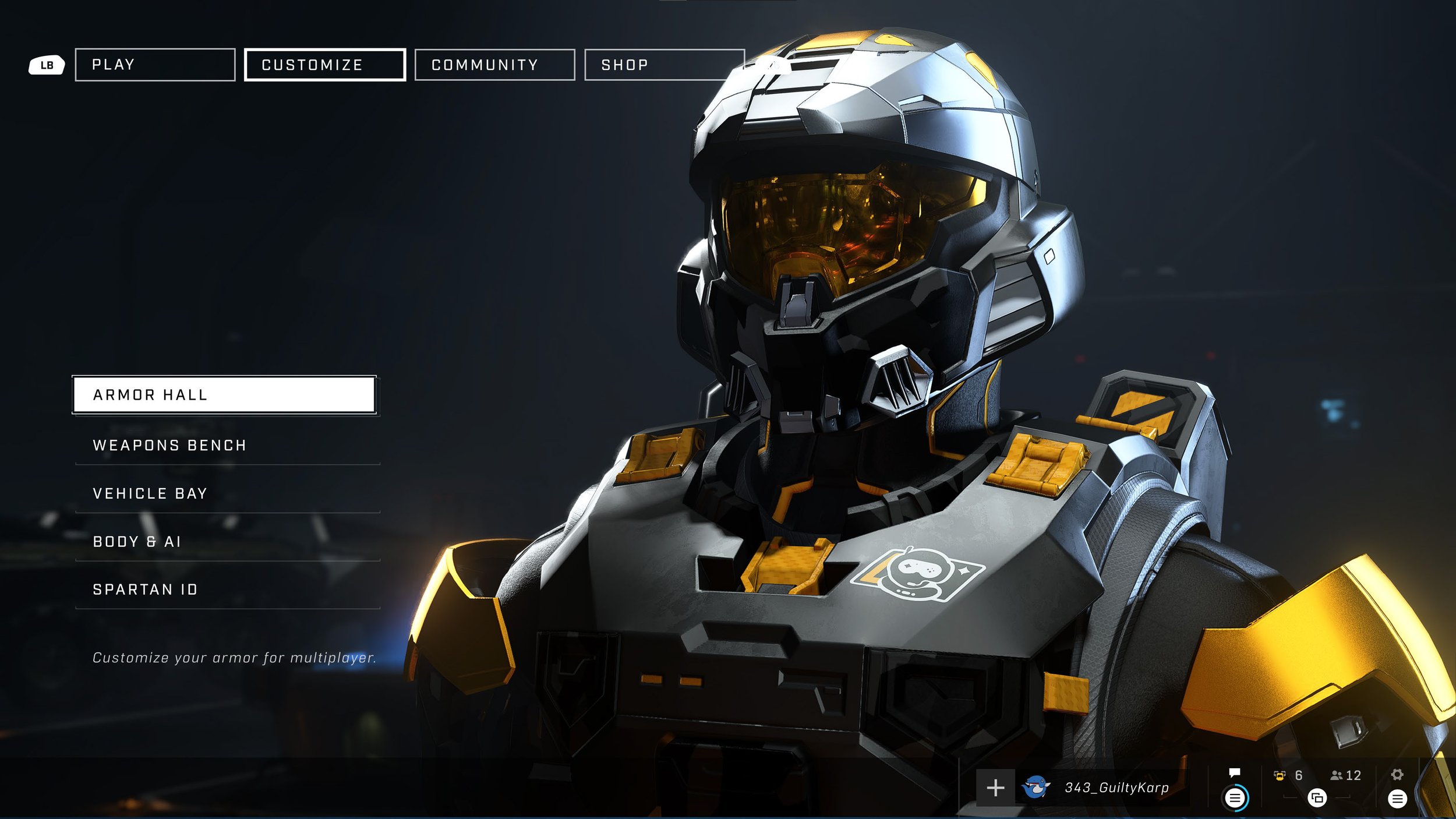
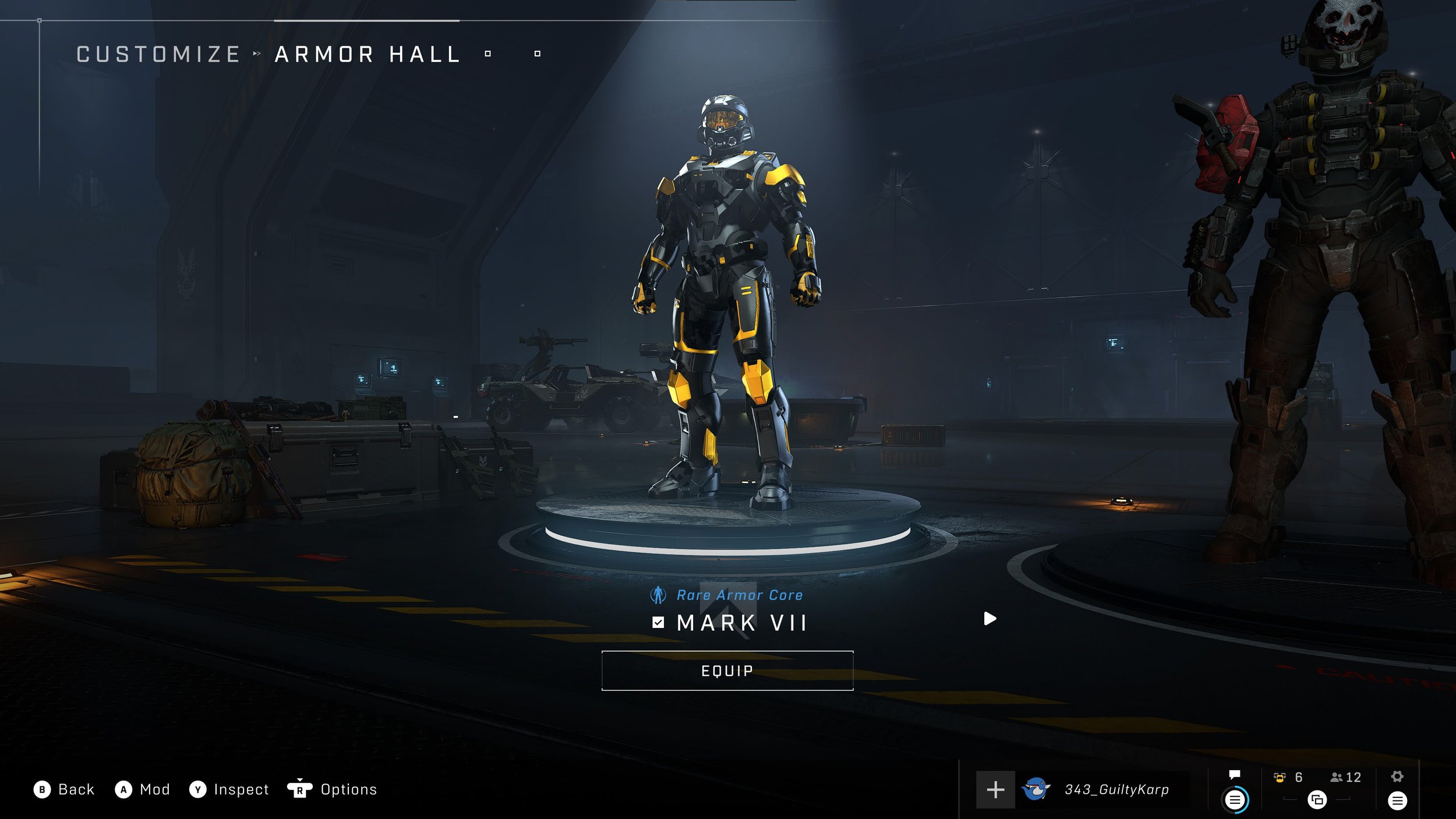
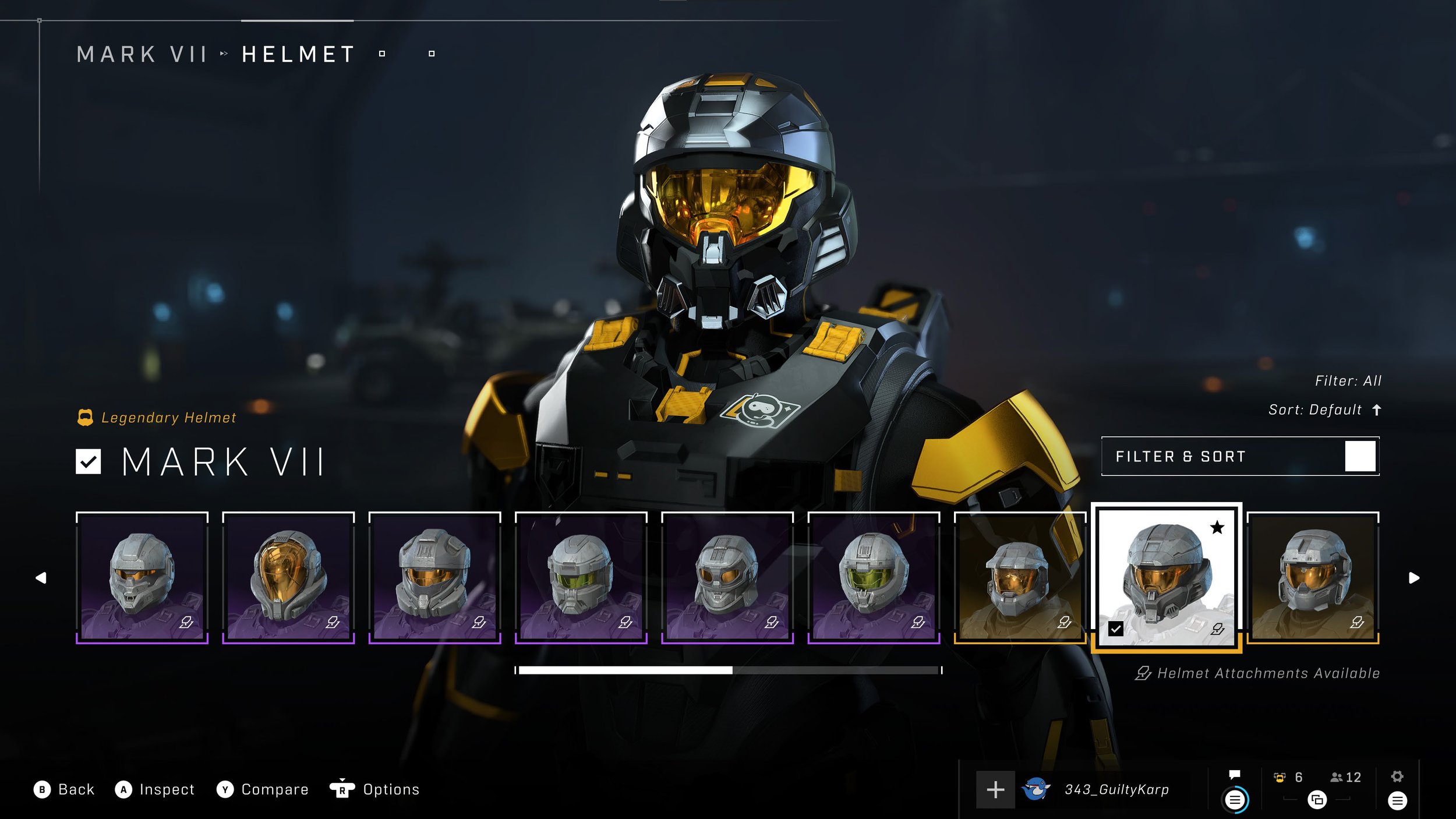
When not working with other artists, I spent much of my personal time designing within Customization. Working hand-in-hand with UX, we iterated on wireframes concurrent to my creating of vision frames for the feature. Elaborating upon our visual language here eventually led to the proper extension of our all-up design system. This soon bled over into our Battle Pass Rewards Track as well. For further reading and insight into my time on Customization though, you can click here to read more.
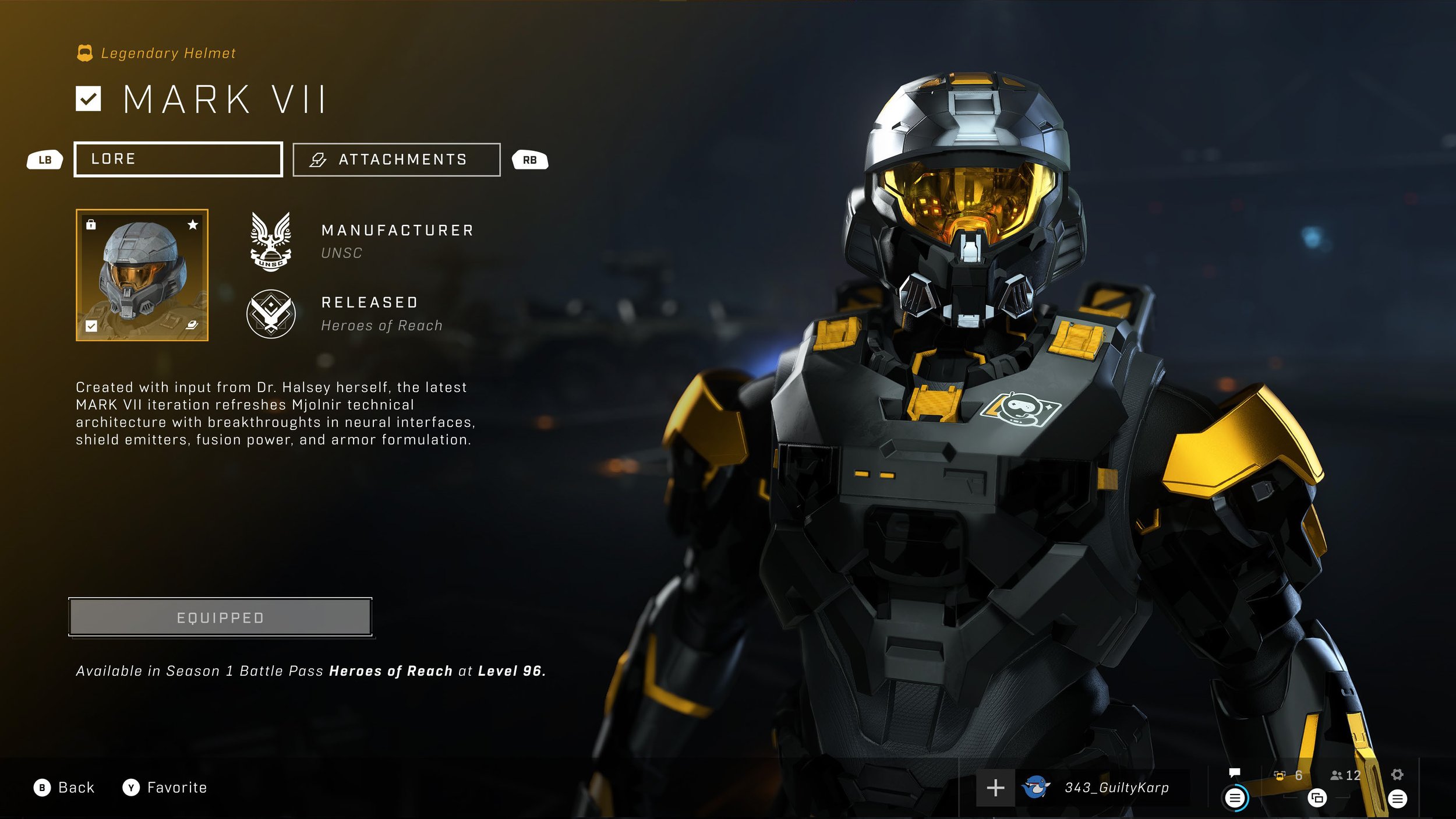
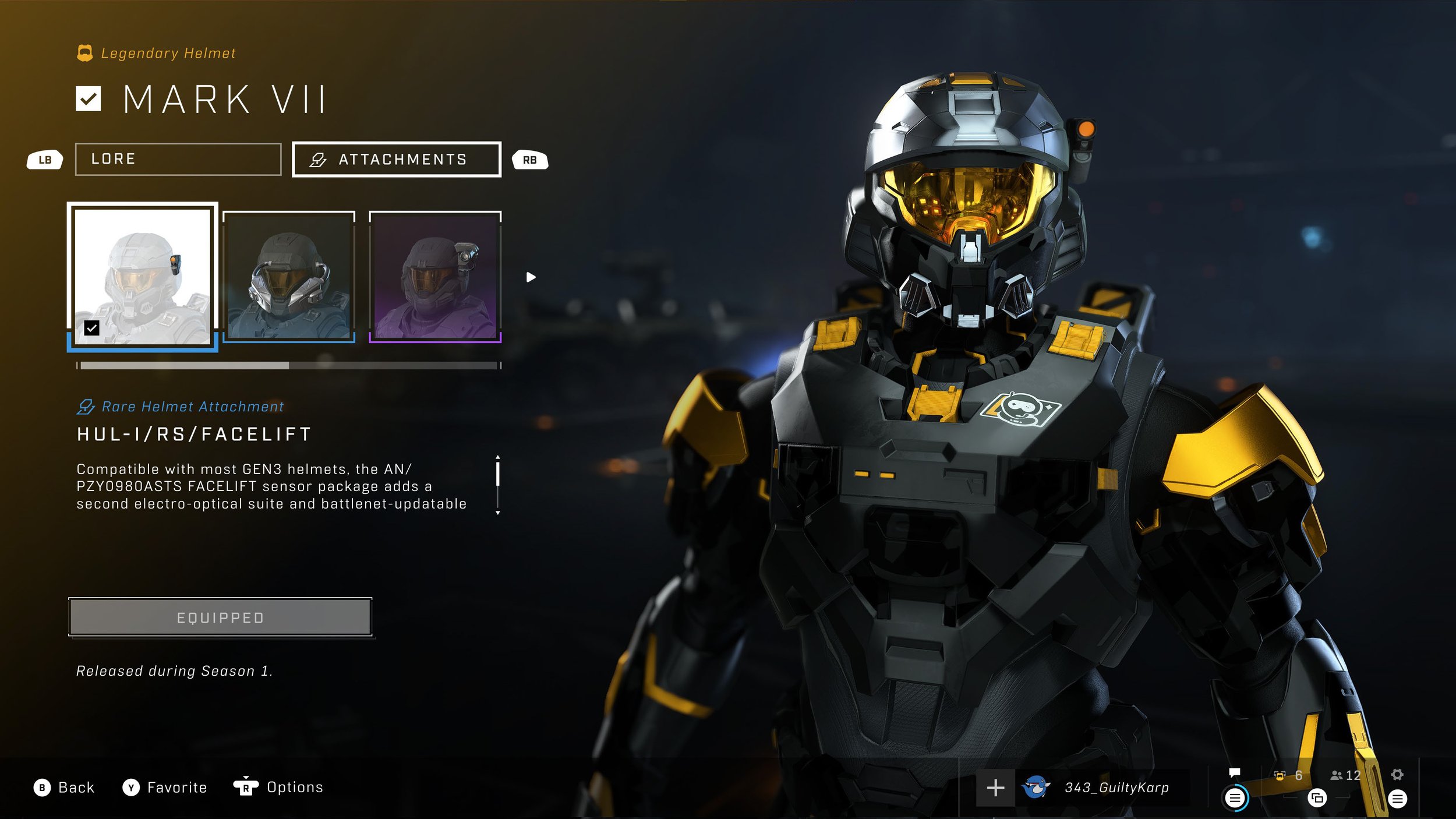

ICONOGRAPHY & MEDALS
Our iconography and multiplayer medals are prime examples of work I led in partnership with our dedicated icon designer and presentation director. Stretching across our various game modes, front-end features, item types, campaign, and more, I helped establish multiple tiers of art direction and the adaptation of color relative to the players’ nearness to gameplay. The further away they were from playing, we kept our visuals simpler and minimal, but once in game, our designs inherited the color philosophies associated with our HUD system, VISR, and our more skeuomorphic medal designs. The modernization of our iconography, medals, and holistic design language was a delicate balance between respecting legacy and finding new ways forward for the franchise.
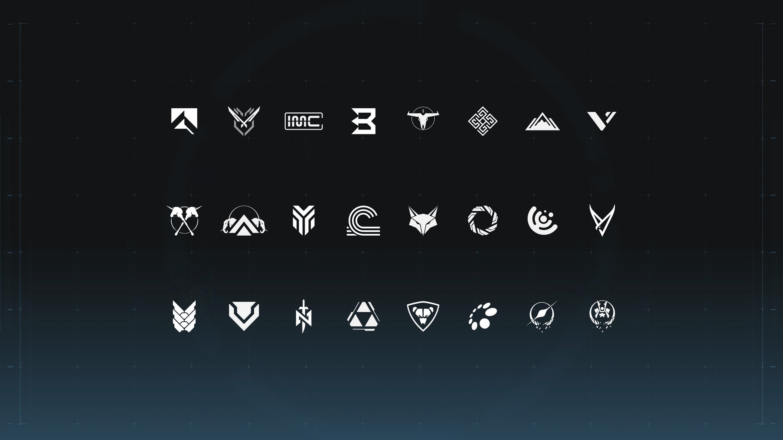
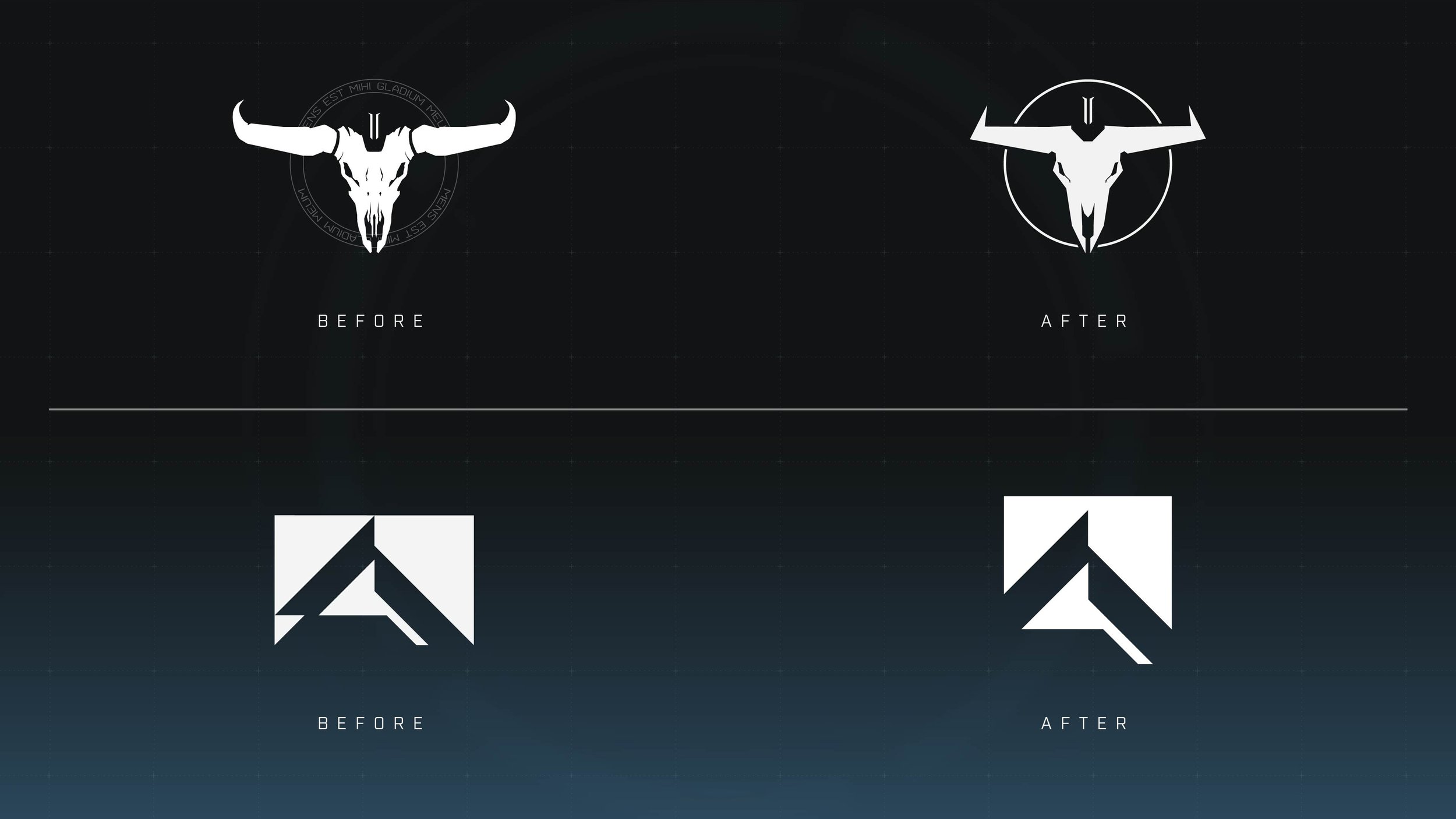
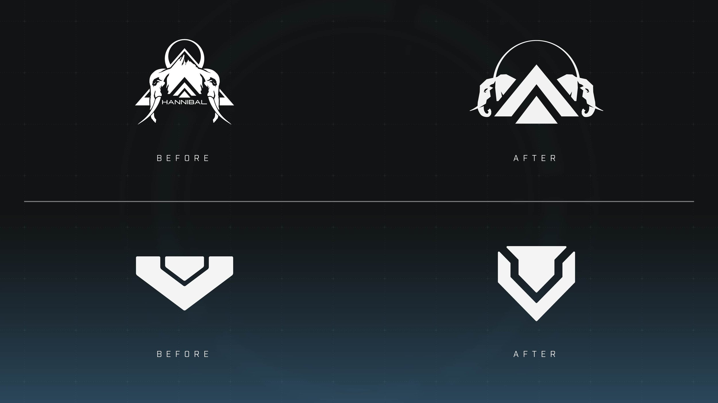
IN-WORLD BRANDING
In a similar vein as our iconography, I collaborated with our presentation director and various designers (across multiple teams) in standing up and modernizing our in-world manufacturers. I spent my fair share of professional time as a brand manager, so I considered it a joy being able to breathe more life into these brandmarks. Like with our icons, balancing the reverence of legacy while also modernizing the logo designs became a series of rebranding projects that all happened in tandem.

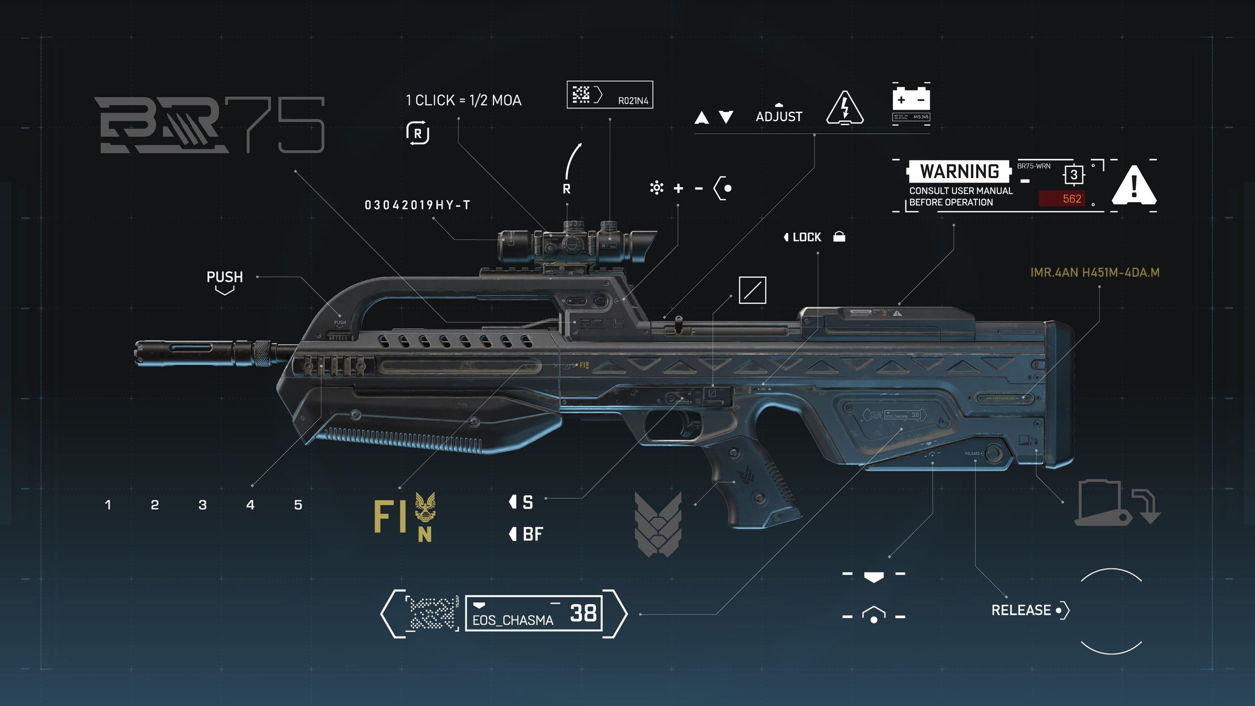
REALIZATION + IN-WORLD GROUNDING
Building upon our manufacturer branding, we frequently collaborated with our campaign, sandbox, and model-shop teams in extending the guidelines and visual language we’d established to the assets themselves. Sometimes simply manifesting as holograms to increase the discoverability of our in-world items, we also worked on weapons, armor, and consumables to further ground the branding within the world.


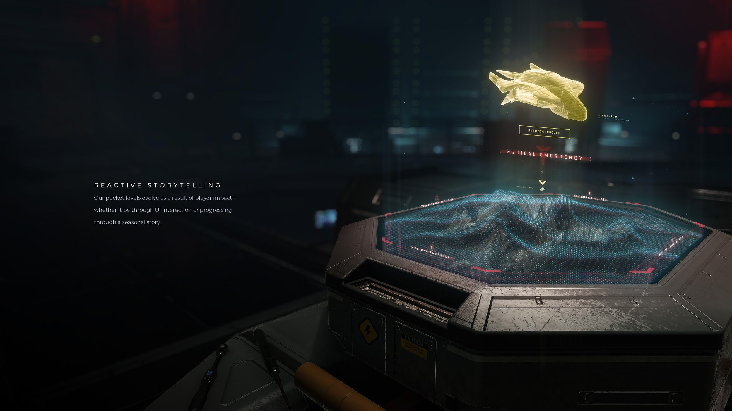
REALIZATION + POCKET LEVELS
Another large aspect of my current role is the Realization of our game levels for our Menu Systems. The previously discussed Customization Hanger along with our collective UI front-end game levels are some examples of these. I lead a cross-disciplinary group (Worldbuilding, Lighting, FX, Animation, UX, UI, etc.) by concepting and building out design methodologies that evolve alongside our seasonal narrative as our players progress through the content. This aspect of my role requires a great deal of communication across the various disciplines in determining the feasibility of our tech, how to leverage such within reason, and when to push for new tech to be created.
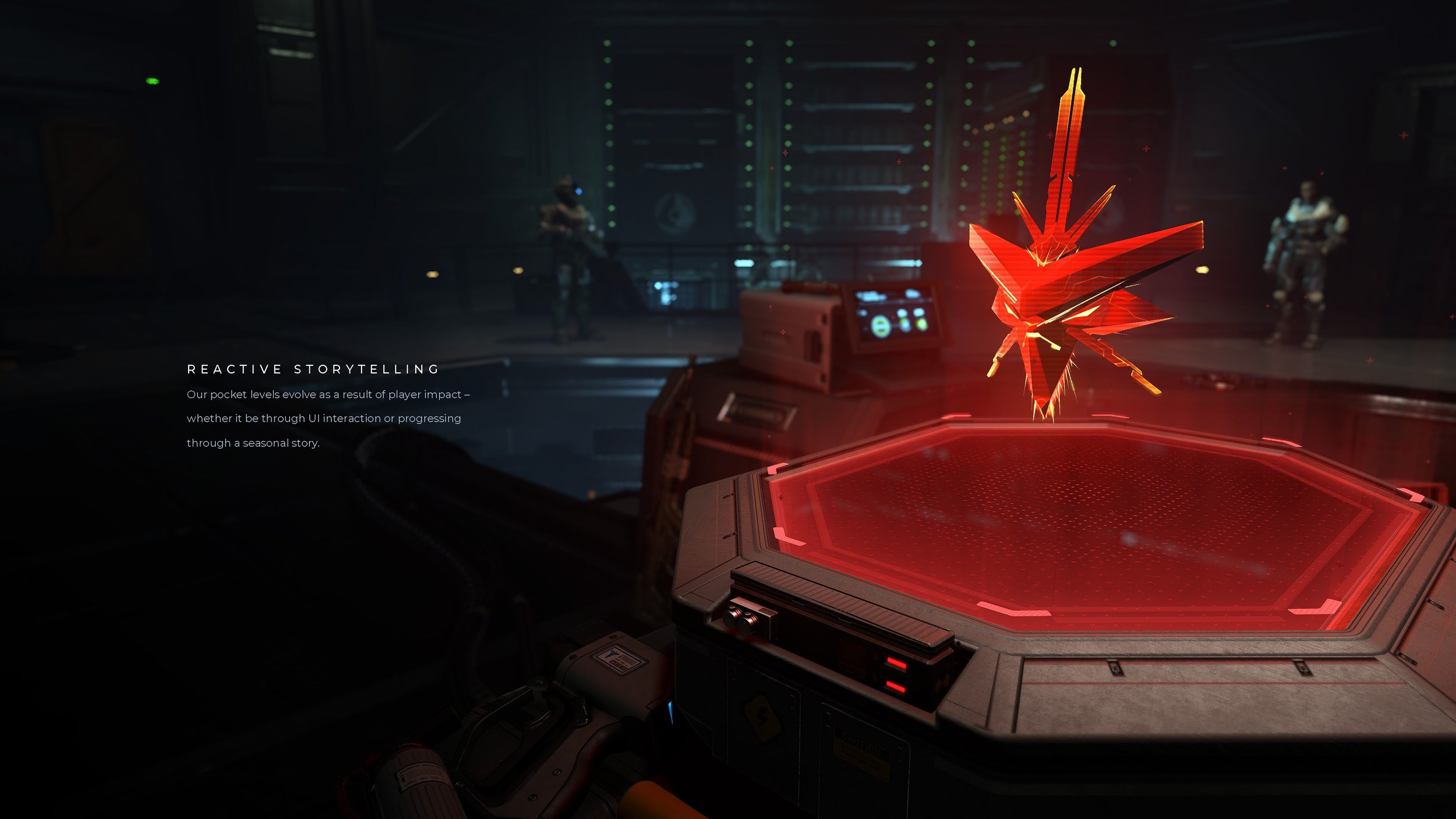
When not working across teams and aligning with stakeholders, the other side of the coin is designing our worldbuilding sequences, their corresponding philosophies, and creating detail-driven cue sheets for our various disciplines. The majority of this work is my proposing to and/or designing alongside the Presentation Director in the collective realization. Depending on the content beat, we scale up or down to the degree of which we adjust our world-state in correspondence to the seasonal narrative. We communicate these ideas out to the larger team by virtue of two categories of worldbuilding—Passive and Reactive Storytelling.
Reactive Storytelling
Starting with the latter, we describe Reactive Storytelling as content shifts that take place in response to a player’s progression through the story. As they accomplish certain feats or complete certain events (which typically earn them a narrative cutscene), we adjust the world-state of our seasonal level design based on the specific details that have been learned while watching the cinematic.
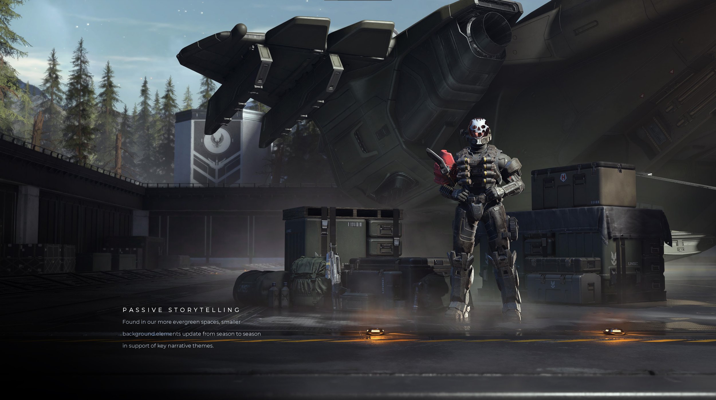
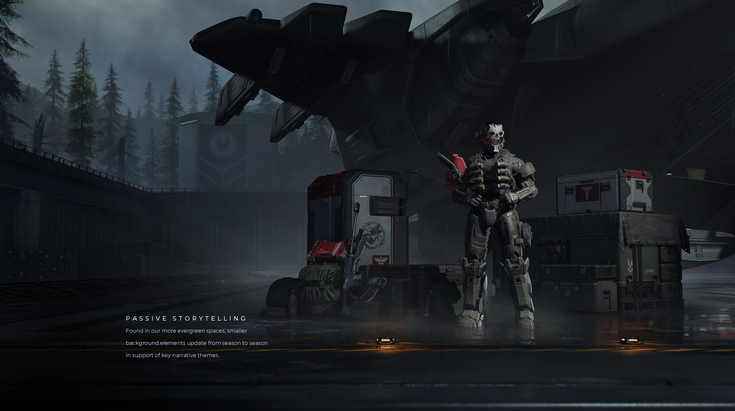
Passive Storytelling
Similarly, Passive Storytelling also pertains to the swapping out and updating of our front-end level’s set dressing, time of day, etc., but the logic for the updates is where things philosophically differ. Where Reactive Storytelling is more closely tied to the immediate changes based on the developing story, Passive Storytelling adjustments are usually seasonal worldbuilding that takes its cues from explicit or even implicit details about the world that we suggest as we roll over from season to season. This type of storytelling, however, does not typically unfold over the course of the season itself.
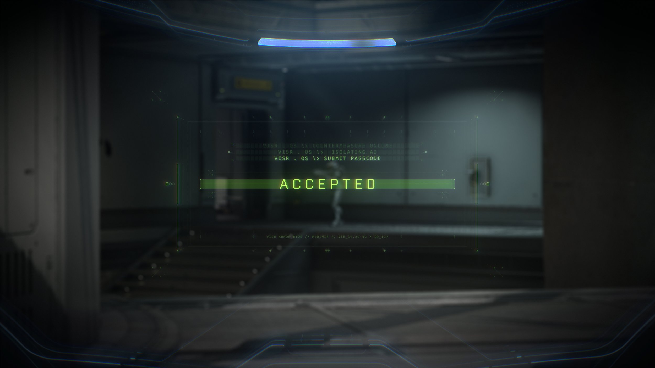
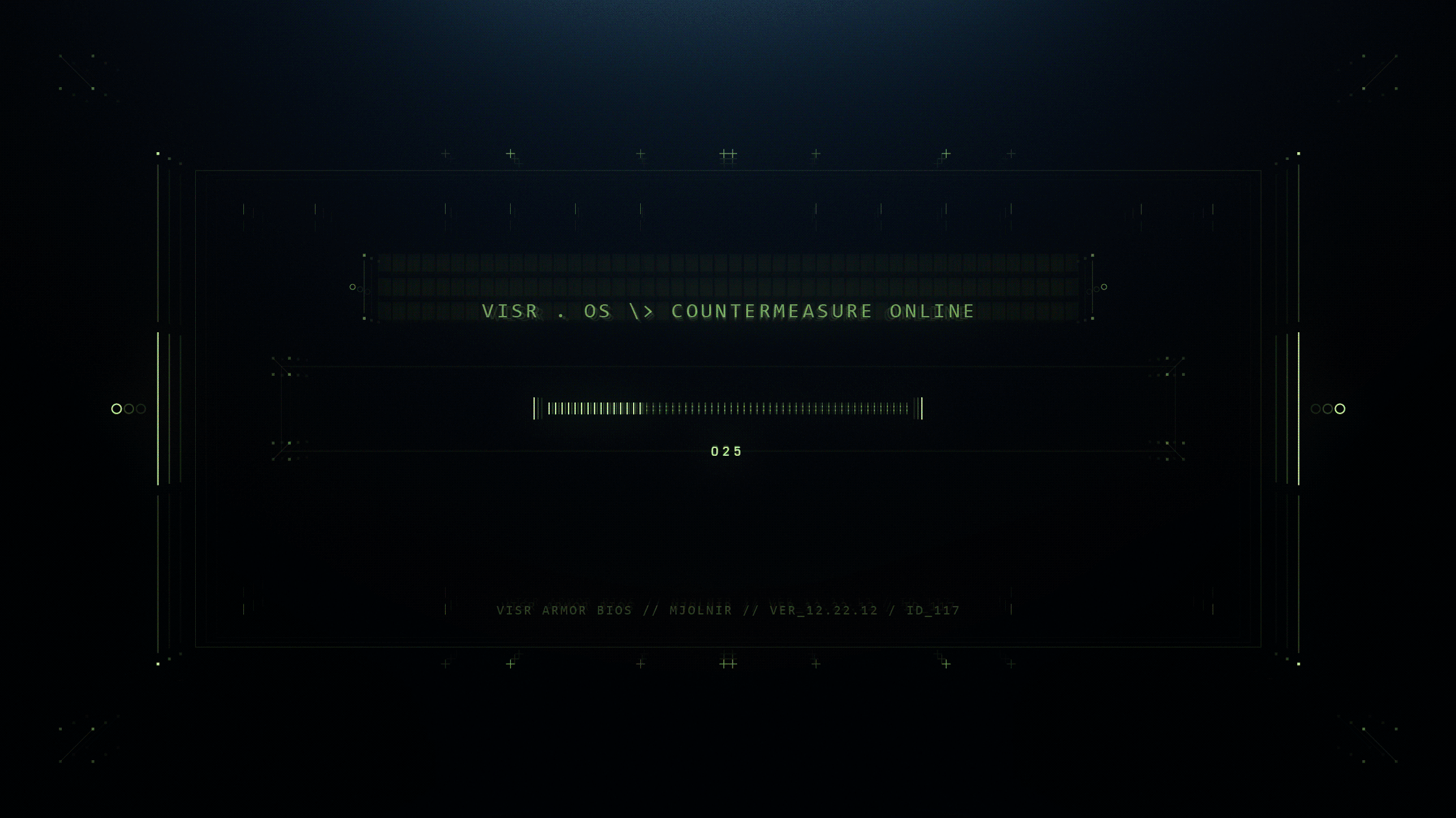
VISR OS
The foundation of Halo’s heads up display is rooted in VISR (Visual Intelligence System Reconnaissance). For Halo Infinite, we continued to expand upon the system in concept and further suggest tiers that most closely relate to modern day operating systems. The collective would still remain known as VISR OS, but we wanted to bring more visual distinction between the HUD’s “front-end” and “back-end” messaging. Think of the classic blue graphic elements as “Windows” (yes, like on a modern PC) where our green elements would more closely resemble “DOS” (It was called VISR BIOS though, specifically).
During the campaign, we would leverage these new “back-end” messages to convey when Master Chief would interface with external back-end systems or upgrade his suit after the player would choose new skills on their progression path. This was especially prominent when Chief considered deletion of The Weapon. I’ve otherwise included a few examples of the design and motion comps I had created for VISR BIOS (along with my philosophy diagrams) below.


IN-GAME MESSAGING
Further elaborating upon VISR, our in-game messaging was primarily delivered through our cyan components. Whether it be for loading, objective, or mission completion, these elements existed within VISR OS’ front-end and carried the performance and objective-driven messages directly to the user.


The most complex example of the in-game messaging I had the opportunity to work on was our Banner System. Existing mostly within campaign, but later extended for multiplayer, I worked on the collective UX, Visual & Motion design for the feature. I identified and considered an array of scenarios ranging from first time player discovery of POI’s (points of interest) to revisitation of POIs, collectible tallies, reward unlocks, and more. To give further context, I’ve included the philosophy chart and motion comp I had created for the system below.

UX & Visual design document detailing the various banner states for Halo Infinite’s campaign. Tap or click the above for a full-res image.

SHADER CACHE
Lastly (for now at least) is the Shader Cache video. This project I concepted, pitched, & created in fulfillment of the product’s need to compile shader data during the user’s first launch of the game (or after large patches). This is a modernized nod to the original Halo CE loading screen where light would move through the ring from a wide, but semi-cropped shot. For Halo Infinite, we pioneered some clever technical ways to get 1 to 1 camera data exported from Slipspace and brought into Cinema 4D. I then brought in various chunks of the ring’s islands before organizing their placement and designing FUI-Like elements as a canvas for light to travel through. There were four scenes in total, but the shot below is my favorite as well as the most directly connected to the original concept.
