
CONCEPT / PHILOSOPHY
The magnitude and grandeur of Halo’s level designs are essential to the various titles’ worldbuilding and player experience. These qualities are so distinct that they have become a hallmark of the brand. My proposal was to expand these elements across multiple locations and directly link them to 343 Industries. By showcasing Forerunner structures and their architectural design, I aimed to associate 343 as a studio with the Forerunners' larger role in the overarching story, suggesting 343 as true world builders.

Concept art illustrating the Halo ring during its self-maintaining construction. Helped inform foundational concept.

Interior scene of Forerunner structure. Referenced for mood, scale, and atmosphere.
Conceptually drawing from the above concept art images, I collaborated with one other artist in the creation of various pieces of line-art that would serve as the basis for the grounded, forerunner-like rendition of the 343 Logo.

We continued translating our forerunner line-art into usable structures that would later serve as the foundation for the 3D modeling of the logo’s numeric glyphs.

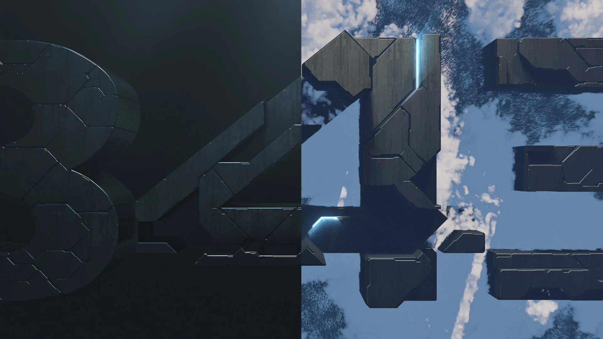
Once the logo was designed, animated, lit and inserted into relevant scenes, I created style frames to demonstrate how the logo would change within different contexts. The frames on the left show the potential usage of the logo in a linear narrative for TV shows and web content. The frames on the right depict a more Halo Infinite-focused design, centered around the game’s location—the ring.
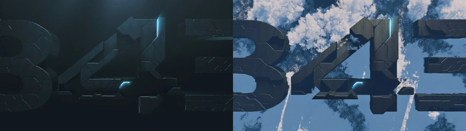
At the resolution of the logo’s animation we arrived at the following lock-up. Maintaining the cleanliness of the logo, but presented in an even simpler form.

Ultimately, we did not proceed with this project, but it still has a special place in my heart. Below you’ll find two of the editorial and sound design cuts that were proposed.
Editorial / Sound Cut A
Editorial / Sound Cut B